
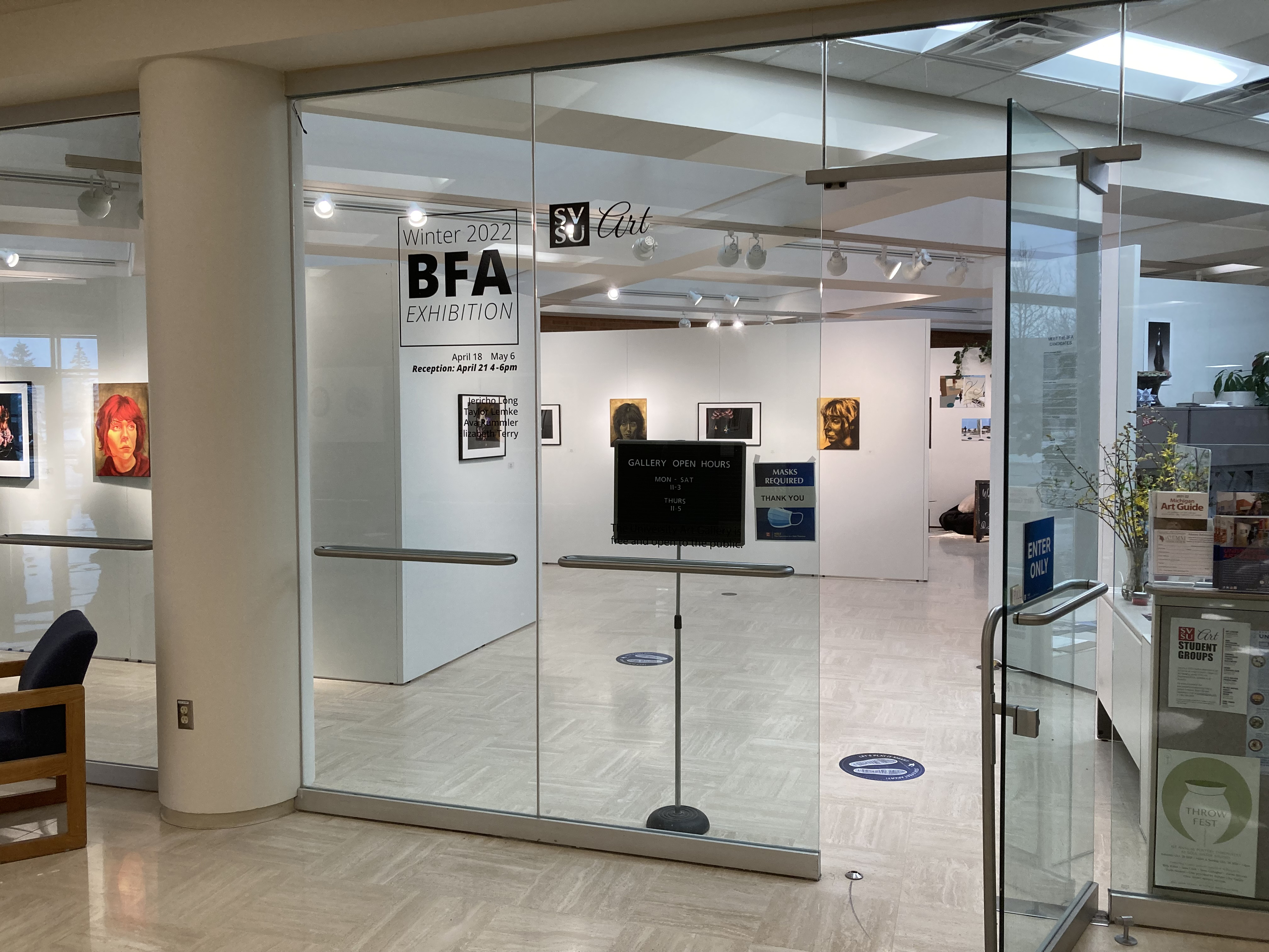
Bachelor Fine Arts Exhibition - Winter 2022
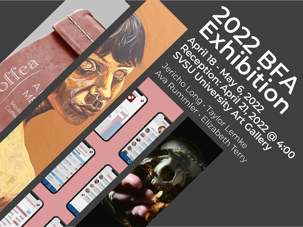
April 18 – May 6, 2022
Reception: April 21, 2022, 4 - 6 p.m.
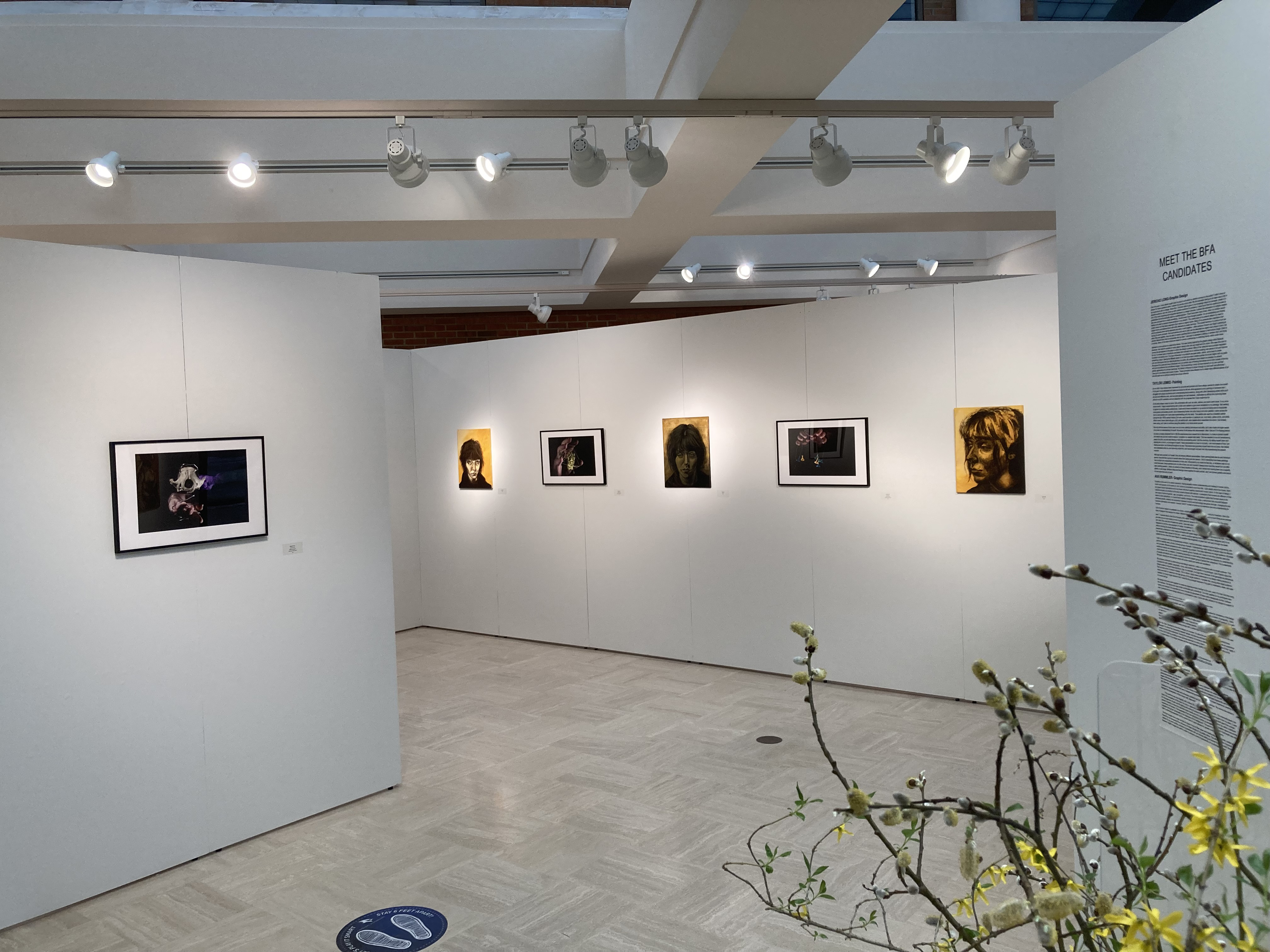
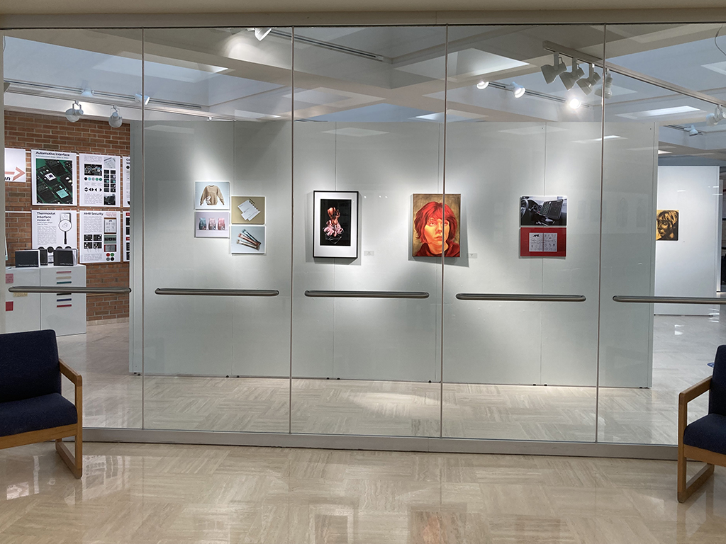
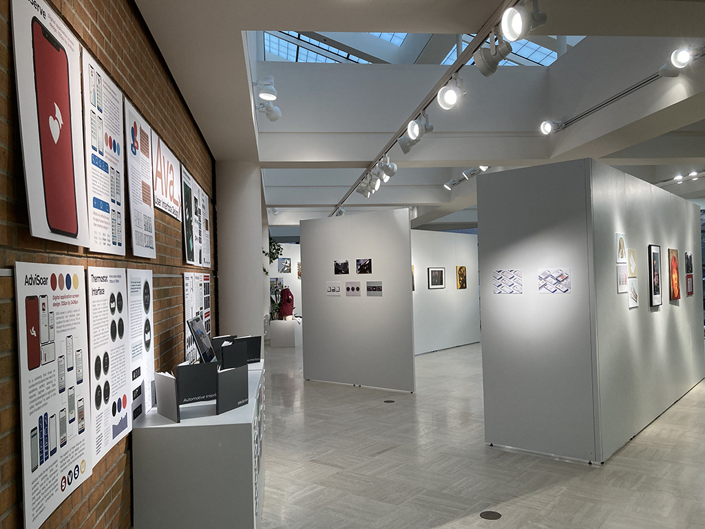
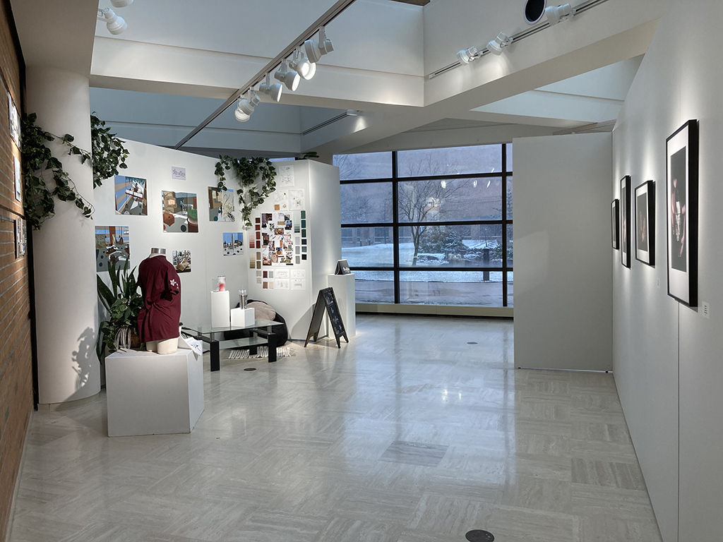
This exhibition features artwork by the Bachelor of Fine Arts candidates and serves as a completion of their undergraduate program. Exhibiting students include candidates in the disciplines of graphic design, photography and painting. Jericho Long will be presenting her coffee shop project in Graphic Design, Taylor Lemke will be presenting her images of self portrait in painting, Ava Rummler will be presenting her Graphic Design projects in user interface design, and Elizabeth Terry will be presenting her portfolio of digital images.
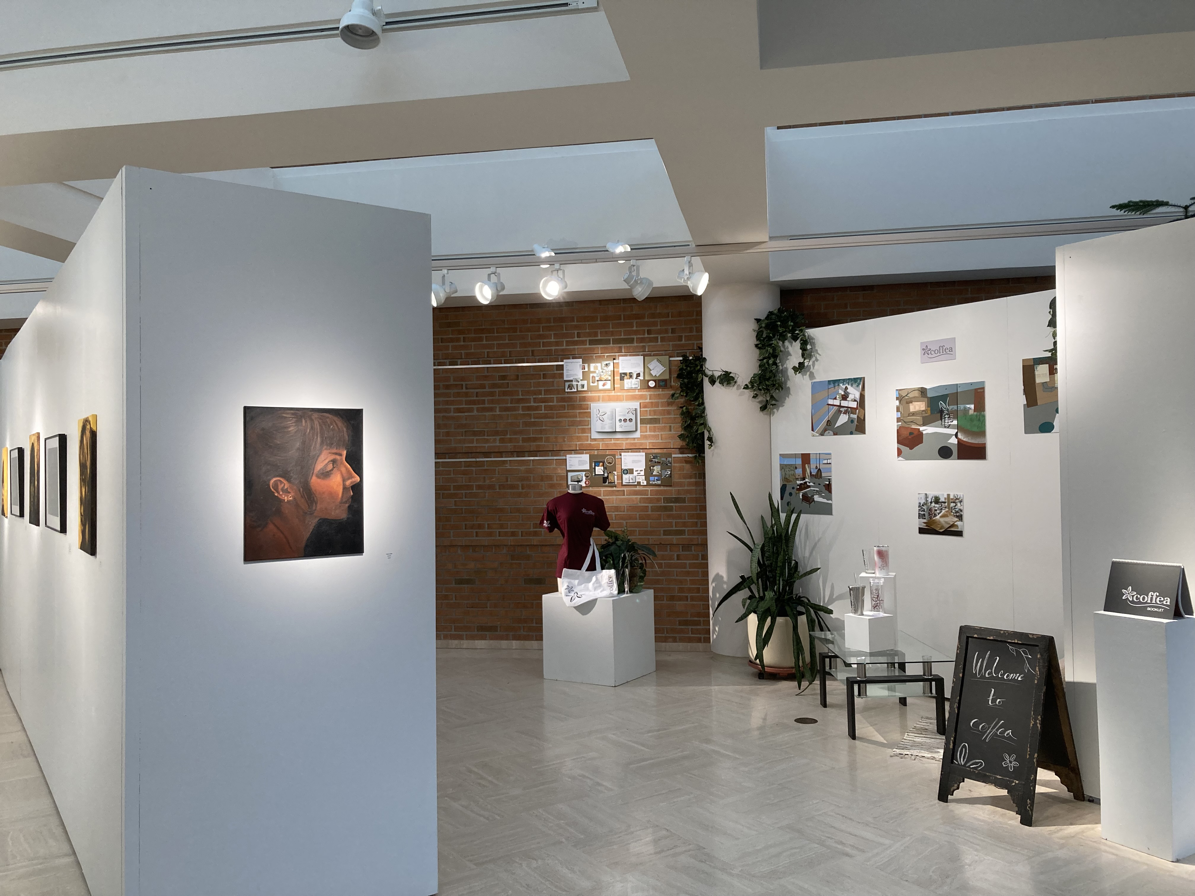
Jericho Long: Graphic Design
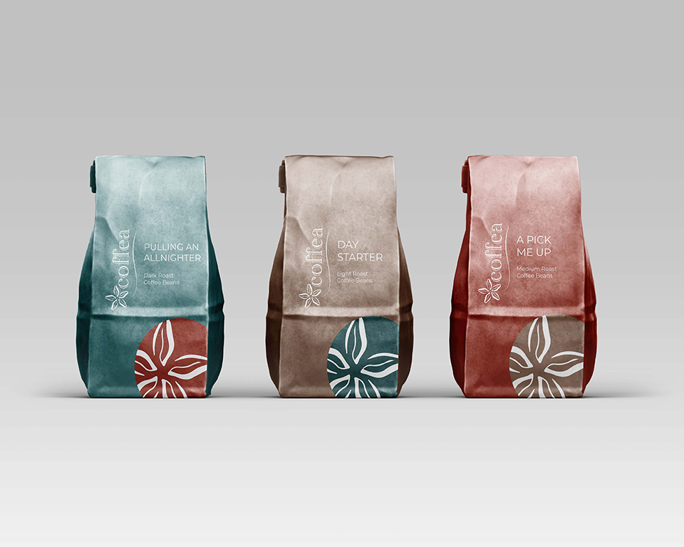
Shown: Coffea package design, 2022
Over the years, I have asked myself what my style is and what my artwork conveys to the public? I didn’t have an answer for these questions when I started my journey as an artist. My first semester taking an art class was in fall of my sophomore year in college. Since then, I’ve been able to grow in my knowledge about art concepts, needs of a targeted audience, and can come up with creative solutions for problems. I have found that the creative process is one of the most rewarding and enjoyable elements in a design process. It allows the exploration of multiple creative possibilities that will eventually lead to a suitable solution. There have been many times, when my intuition would take over and lead me to create something, I would never have thought possible. It is an exhilarating and freeing feeling to be able to express these emotions in my artwork. The overall style of my artwork reflects my need to create unique art that takes inspiration from nature or organic forms. Many of my artworks take inspiration from organic forms and balance them with other elements to create harmony. The overall harmony in a piece of art can only be achieved when all the elements are able to work together. I often perceive Vincent van Gogh’s painting as having the same concepts. His brush strokes and use of color can be described as organic and unique in form, but when they are together, they are able to create a painting that is unique and displays a harmonious image. Color is another element that I like to incorporate into my style. I use color to represent a feeling or emotion that I am trying to convey. Many of the warm tones are meant to convey a welcoming or comforting theme, while cooler tones represent a more serious or melancholy theme. This was mainly inspired by the graphic design artist Deborah Sussman. Her artwork consists of many pattern designs that use very bright and fun colors. She uses this color to convey the atmosphere of the place in which the design is placed. Many of her artworks have provided inspiration for me. It is these types of emotions and ideas that motivate me to continue creating new pieces of art and improve my skills in all styles of art. The main influences in my artwork are past artists, nature, and a need to create something unique. Seeing the different styles of art that have been created pushes me to aim higher with my goals and use techniques that can help me develop my skills. My professors have helped me develop my artwork throughout the years and have introduced me to an artistic way of thinking that allows me to think outside of the box and look at problems from all different angles. This is something I could not have learned on my own and feel greatly appreciative for all their teachings. My family’s influence is shown through my hard work and effort that I have put in over these past couple of years. These principles have allowed me to create many different pieces of art and will push me to continue creating new unique artworks.
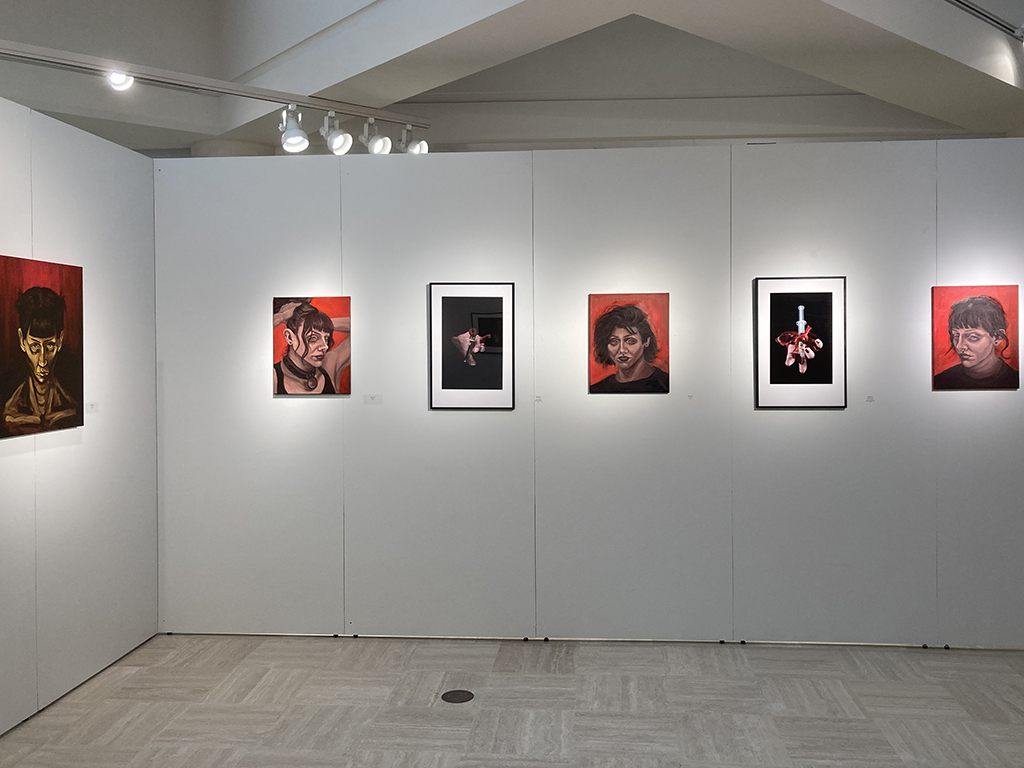
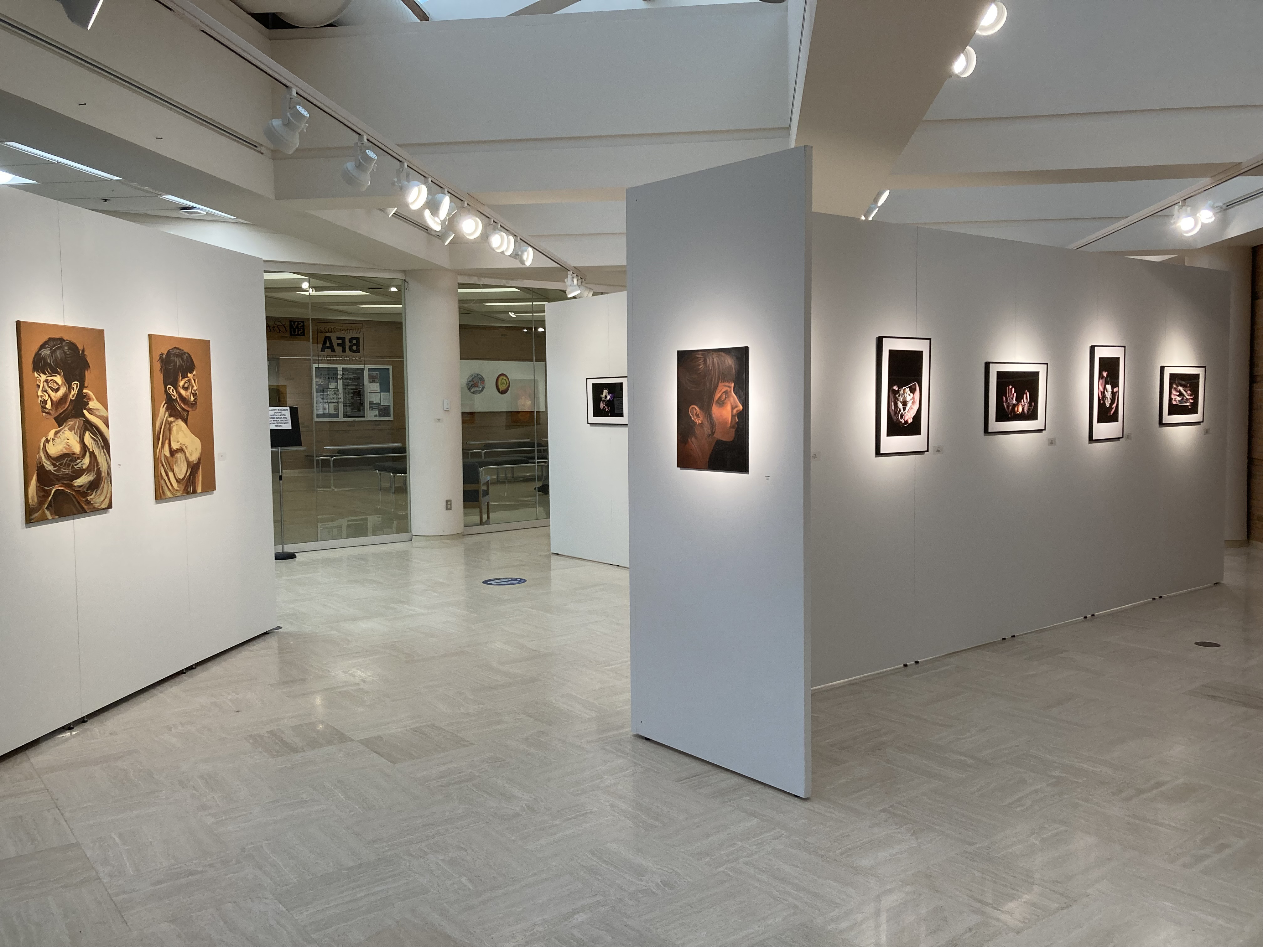
Taylor Lemke: Painting
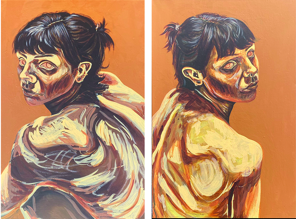
Shown: Vulnerability (left and right), 2022
As an artist I have always been impressed by accurate self-portraits and have always wanted to create one myself. In the past I have attempted and failed and would be left with what appeared to be a painting of someone else. I struggled with proper proportions and understanding facial anatomy, along with other developing artistic skills such as local and reflective color, and accurate lighting and cast shadows. I dedicated my efforts into improving these skills for my BFA exhibition and am delighted with the progress that I have made thus far.
In the early stages I stuck to colors I felt comfortable with such as reds, yellows, and warm earth tones. In my more recent works, I began experimenting with a fuller color palette to give more complexity to my paintings. Not wanting to ignore my intuitive artistic preferences, I kept warm tones consistent in my works but being sure to incorporate more greens and purples as well. Upon researching further into color theory and color palettes I came across the Zorn’s color palette and I have been experimenting with this lately. This palette was used by a Swedish painter during the late 1800’s named Anders Zorn who used vermilion or cadmium red, ivory black, yellow ochre, and white. When mixed, these colors will give a full, yet earthly-dull, color palette which resembled the colors I had already been using, and I plan to continue using this palette in my future works as well.
Not only did this series of work open me up to new painting techniques and skills, but it also made me hyper aware of my lack of understanding of myself. My sense of self always felt disconnected; often I feel as if I’m floating behind my body or simply detached from it. My life experiences have caused me to disconnect, in a way to protect myself, and switch into survival mode to ensure I complete my needed daily tasks. This has resulted in me not remembering years of my life, but now also having a hard time remembering what I did this morning. By sitting myself down and starring into a mirror, or an image of myself, I have reconnected my brain to my body. I am more aware of how I am feeling and what I am thinking throughout my day. This series has grounded myself back into my body, has helped me understand what my own face truly looks like, and has brought me back into fully experiencing the present moment.
Although each portrait is of myself, they all embody different personalities. Each painting feels like its own individual person; they feel like a group of people rather than being just one person. I find it interesting how these paintings took on their own uniqueness somewhat on their own. Influenced by my mood for that day, or whatever was on my mind that week, these portraits took on a life of their own and I wouldn’t always know how they would turn out after each painting session. I allow my artwork to freely breathe in this way, and I refrain from boxing them into a specific sketch or set image. Multiple ideas and feelings came together for each portrait, and I am forever grateful and proud to now have this body of work.
Ava Rummler: Graphic Design, User Interface
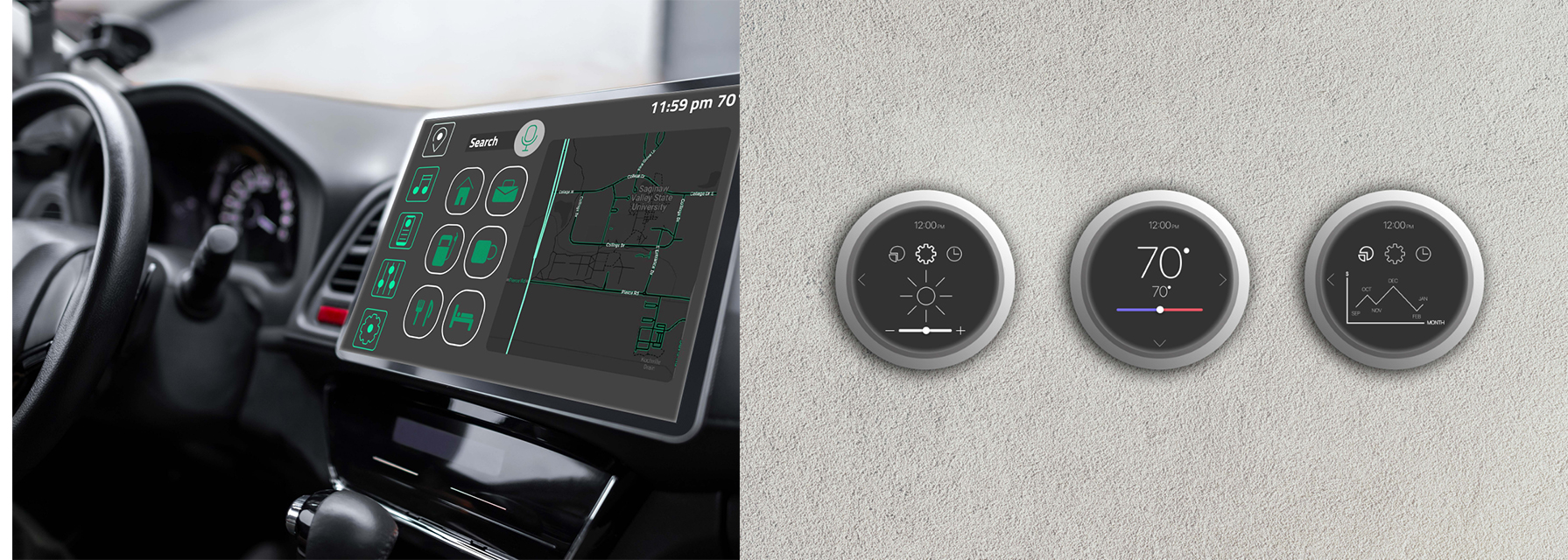
Shown: Auto user screen (L) and Thermostat buttons (R)
Empathy is the root of my artistic decisions. Having empathy means understanding and relating to human nature, which most people on this earth do, but I strive to understand more than that. I care deeply about how hopes, fears, and goals impact interactions and how these individual qualities coexist with human nature. In the case of design, I practice empathy by relating to the way humans interact with devices. I understand that humans are different in their own ways in terms of gender, age, occupation, and more. The most consistent quality that humans share is the desire to feel understood. In a world that’s rapidly changing in many ways, a disconnect has occurred between individual people. Instead, the connection between humans and technology has grown stronger, changing the way humans understand one another. I pursue “UX/UI” In order to continue my extensive care and understanding for humans.
Lots of factors helped me establish my values, including designer Julie Zhuo who works for Facebook. She’s the type of designer that designs for others “different than her.” She believes that “there is no such thing as an average user.”1 I learned about Julie Zhou through a film called “Design Disruptors,” created by Invision. This film alone provides me so much clarity on how to apply personal values to design. I care about uniqueness in human beings and Julie Zhou puts this mindset into words. I also was inspired by others from the film such as Mike Davidson, a designer for and the vice president of Twitter. He believes that the best design is invisible and understandable without noticing the small decisions that designers make. This provides me with a professional view on how to make people feel understood in their needs and wants with subtle design factors that aren’t obvious to the user. This way, the interaction feels natural for the user. I want to continue gaining more insight from other designers and I’m so grateful for the ones that have helped me establish this empathetic mindset that I will carry through my career.
I start my projects with this compassionate mindset. I conduct interviews, research human factors engineering, and perform usability tests, all with a diverse group of people. Understanding a wide variety of people helps me discover and consider different perspectives when approaching a project. This helps determine my target audience. My target audiences always are narrowed down to a specific group of people, but I keep in mind other possible users that could interact with my designs. Considering secondary or even tertiary target audiences expands my understanding of people and allows me to create a product where the largest group of people feel understood. This is essentially the goal; creating an atmosphere where all human needs and wants are considered.
My process continues by determining what design decisions I make in accordance with my target audience. This includes the color palette, typography, icons, and anything else specific to my prototype. Lots of factors about the target audience impact these decisions. Age, for example, is a huge factor because of the generational preferences that are held when it comes to design. This is where I apply these preferences to my design making decisions to make sure that I’m catering to the age groups of my target audience. I consider this, among other target audience qualities, for every single decision that I make for the prototype because of my goal to understand, relate, and cater to human beings.
My design elements work together to create an experience that’s familiar to the user, even if it’s their first time using the interface. This allows the user to feel comfortable and understood. The color palettes for my prototypes have variety and contrast. It’s important for me to choose the placement of these colors strategically so that I achieve color contrast and every design element is comfortable to view. Colors are also utilized in my designs to support UI patterns such as “hover controls” and “clear primary actions.” These UI patterns allow for consistency in the design which is essential for the user experience. Another design element that I thoroughly consider is typography. Users being able to fluidly read on a screen is crucial. I accomplish this by always choosing a san serif typeface. San serif is a non-distracting typeface that is easiest to read on a screen. The san serif typeface I use in most of my interfaces is “San Francisco.” This typeface includes a variety of styles which is important because of my design goal of displaying variety while still showing unity. Unity is also an important quality that I strive for my icons. I always set this standard in my icons to keep the entire interface familiar for the user. The collaboration of these design elements creates a visually interesting design with a unified style that keeps the experience effortless for the user.
For me, User Interface is more than designs on a screen. It’s about the process and reasoning behind those designs. It’s about the interactivity between people and devices and how successful designs create an experience where humans feel understood. Having this connection to humans is valuable to my work because of how I apply it to the UX/UI field by creating a more personal approach to every interview, test, and design. Empathy is the consistent factor in my design process and the most important quality that I have as a designer.
Bibliography
Design Disruptors . Design Disruptors The Future Is Design - A Documentary by
- Invision. Invision, 2016. https://www.invisionapp.com/films/design-disruptors.
Elizabeth Terry: Photography
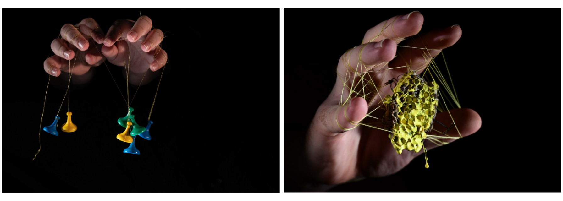
Shown: Machinations (L) Antipathy (R) Digital images, 2022
My artistic drive is firmly planted in the broad range of communication that art allows; rooted in my early experiences in art therapy. In this body of work, I have explored visual allegory; creating visual fables in relation to my view of the human condition.
My creative philosophy has developed from the study of Artist Jerry Uelsmann who begins work without preconceived ideas and shares the truth that “one is more frequently blessed with ideas while working.” This project began with that philosophy in mind. As I worked, I focused on hands as a metaphor for the self. I took inspiration from German photographer Annegret Soultau whose morbidly stitched self-portraits inspired the use of string, wire and other ties. I used objects that carry metaphorical symbolism to ideas of the human experience; keeping in mind Uelsmann’s idea that the best work obviously symbolic but not symbolically obvious. The various ties worked to highlight the juxtaposition of the human self, ideas and the connections we form.
This portfolio was shot digitally with a Nikon Z5 in the SVSU photography studio. The community studio was vital to the completion of this work not only in space but also in the energy, help and support from my peers. I used an arrangement of split and fill lighting and scrims to achieve the illusion that the hands exist apart from a single person’s identity to force the idea that these hands are not a particular human’s experience but rather a particular experience of humans. This separation from the individual is further accentuated by the negative space around the subjects hiding their physicality in the darkness of the background. The use of a 170-200mm focal length was also vital to achieving separation as the narrow field of vision allowed for greater control of exposure.
The final images were inkjet printed on Epson Fine Art fiber paper and traditionally hand mounted, matted and framed by me because of the influence of Hideki Kihata on my artistic ethos. This ethos was also important in relation to my work as this collection is presented with as minimal editing as needed for the standard deviation between digital images and print in order to achieve a level of authenticity of my photographic craft.
CONTACT US.
Art Department
J. Blake Johnson, Chair
University Art Gallery
gallery@svsu.edu
(989) 964-2291
To join or update our mailing list, contact gallery@svsu.edu