
Ava Rummler- Graphic Design, User Interface
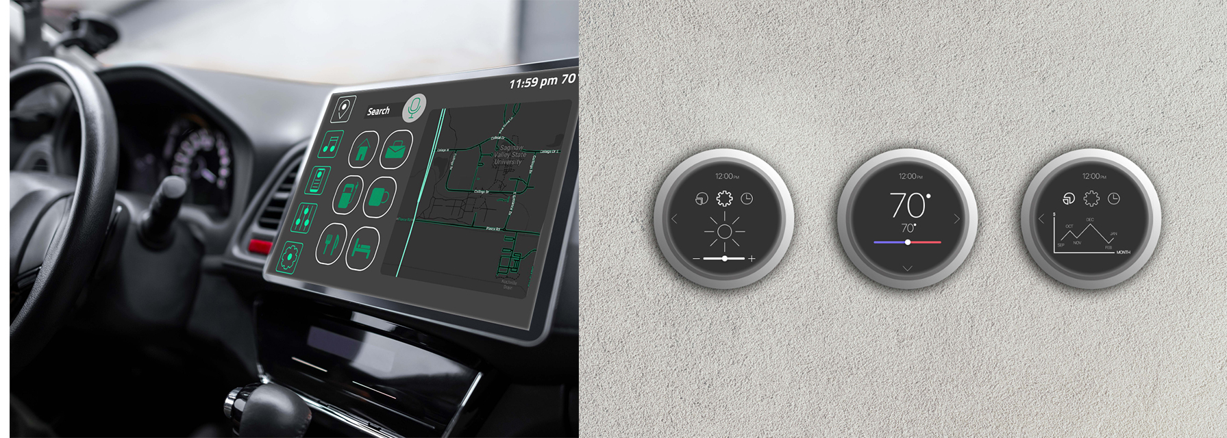
Shown: Auto user screen (L) and Thermostat buttons (R)
Empathy is the root of my artistic decisions. Having empathy means understanding and relating to human nature, which most people on this earth do, but I strive to understand more than that. I care deeply about how hopes, fears, and goals impact interactions and how these individual qualities coexist with human nature. In the case of design, I practice empathy by relating to the way humans interact with devices. I understand that humans are different in their own ways in terms of gender, age, occupation, and more. The most consistent quality that humans share is the desire to feel understood. In a world that’s rapidly changing in many ways, a disconnect has occurred between individual people. Instead, the connection between humans and technology has grown stronger, changing the way humans understand one another. I pursue “UX/UI” In order to continue my extensive care and understanding for humans.
Lots of factors helped me establish my values, including designer Julie Zhuo who works for Facebook. She’s the type of designer that designs for others “different than her.” She believes that “there is no such thing as an average user.”1 I learned about Julie Zhou through a film called “Design Disruptors,” created by Invision. This film alone provides me so much clarity on how to apply personal values to design. I care about uniqueness in human beings and Julie Zhou puts this mindset into words. I also was inspired by others from the film such as Mike Davidson, a designer for and the vice president of Twitter. He believes that the best design is invisible and understandable without noticing the small decisions that designers make. This provides me with a professional view on how to make people feel understood in their needs and wants with subtle design factors that aren’t obvious to the user. This way, the interaction feels natural for the user. I want to continue gaining more insight from other designers and I’m so grateful for the ones that have helped me establish this empathetic mindset that I will carry through my career.
I start my projects with this compassionate mindset. I conduct interviews, research human factors engineering, and perform usability tests, all with a diverse group of people. Understanding a wide variety of people helps me discover and consider different perspectives when approaching a project. This helps determine my target audience. My target audiences always are narrowed down to a specific group of people, but I keep in mind other possible users that could interact with my designs. Considering secondary or even tertiary target audiences expands my understanding of people and allows me to create a product where the largest group of people feel understood. This is essentially the goal; creating an atmosphere where all human needs and wants are considered.
My process continues by determining what design decisions I make in accordance with my target audience. This includes the color palette, typography, icons, and anything else specific to my prototype. Lots of factors about the target audience impact these decisions. Age, for example, is a huge factor because of the generational preferences that are held when it comes to design. This is where I apply these preferences to my design making decisions to make sure that I’m catering to the age groups of my target audience. I consider this, among other target audience qualities, for every single decision that I make for the prototype because of my goal to understand, relate, and cater to human beings.
My design elements work together to create an experience that’s familiar to the user, even if it’s their first time using the interface. This allows the user to feel comfortable and understood. The color palettes for my prototypes have variety and contrast. It’s important for me to choose the placement of these colors strategically so that I achieve color contrast and every design element is comfortable to view. Colors are also utilized in my designs to support UI patterns such as “hover controls” and “clear primary actions.” These UI patterns allow for consistency in the design which is essential for the user experience. Another design element that I thoroughly consider is typography. Users being able to fluidly read on a screen is crucial. I accomplish this by always choosing a san serif typeface. San serif is a non-distracting typeface that is easiest to read on a screen. The san serif typeface I use in most of my interfaces is “San Francisco.” This typeface includes a variety of styles which is important because of my design goal of displaying variety while still showing unity. Unity is also an important quality that I strive for my icons. I always set this standard in my icons to keep the entire interface familiar for the user. The collaboration of these design elements creates a visually interesting design with a unified style that keeps the experience effortless for the user.
For me, User Interface is more than designs on a screen. It’s about the process and reasoning behind those designs. It’s about the interactivity between people and devices and how successful designs create an experience where humans feel understood. Having this connection to humans is valuable to my work because of how I apply it to the UX/UI field by creating a more personal approach to every interview, test, and design. Empathy is the consistent factor in my design process and the most important quality that I have as a designer.
Bibliography
Design Disruptors . Design Disruptors The Future Is Design - A Documentary by
- Invision. Invision, 2016. https://www.invisionapp.com/films/design-disruptors.
Contact Us
gallery@svsu.edu
(989) 964-2291(989) 964-2291
UAG Coordinator
Department of Art
Blake Johnson, Chair
Office
University Art Gallery
Arbury Fine Arts Center
Contact Us:
To be added or removed on
postal mail or email:
gallery@svsu.edu