
Jess Inman - BFA Graphic Design
Artist Statement
My work explores how visual design can shape not only what we see but also how we feel, interact, and connect within a space. As both a designer and an artist, I’m drawn to the relationship between digital aesthetics and physical environments, where branding and atmosphere come together to create a unified and memorable experience. My cat cafe exhibition reflects this intersection: a conceptual and visual exploration of comfort, community, and design identity. By imagining a cafe that functions as both a social space and a brand, I bring together my interests in digital design, spatial layout, and human connection in one cohesive project.
My interest in art started with a fascination for technology and visual storytelling. Growing up surrounded by video games and digital art, I became captivated by the ways entire worlds could be built through light, color, and texture. Watching and playing games made me aware of how design could capture emotion, and how a setting could feel alive, even when it only existed on a screen. That early experience led me to think about the design choices that shape how people experience visual environments.
Although I experimented with traditional art forms like drawing and painting, I was more drawn to graphic design, where my interests in technology and creativity go hand in hand. I initially wanted to explore computer science as a way to connect technology with creativity, but I realized that coding and other processes didn’t provide the same freedom or sense of discovery that art did. Shifting to fine art and then to graphic design allowed me to explore both structure and creativity, using tools like Adobe Illustrator and Photoshop to experiment with how texture, form, and perspective influence the way a design is viewed.
My cat cafe exhibition became a way for me to combine all these interests: technology, design, and visual experience, into a single project. The brand identity I created combines the comforting qualities of pets and animals with the look and feel of a commercial cafe brand. Every detail, from the colors to the typography, was chosen to create a calm yet inviting atmosphere. The cafe is divided into two sections, one for the cafe and one for the cat lounge, which gives visitors the freedom to choose their own experience. This kind of interaction mirrors how I think about design overall: it should guide people but also give them space to connect on their own terms.
My visual choices are influenced by a range of artists and designers whose work has shaped my personal style. Andy Warhol’s pop art style, defined by flat color and graphic repetition, informs my own approach to visual design. I’m inspired by how he used repetition to create rhythm and familiarity, and by how his bold color choices could transform simple imagery into something iconic. Similarly, I use color and at times repeated forms to build visual cohesion and to bring a sense of energy and playfulness to my work. Do Ho Suh’s installations and sculptures, which explore transparency, scale, and memory, influence how I think about spatial design. His ability to make everyday spaces feel emotional encourages me to think beyond surface-level aesthetics and consider how design can feel immersive and personal.
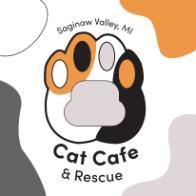
More recently, I’ve found inspiration in Lauren Hom and Jessica Hische, both of whom blend strong technical skill with personality and storytelling. Hom’s hand-lettering and branding work are bright, bold, and welcoming, which are qualities that influenced the tone of my cat cafe’s identity. I am inspired by how her designs feel approachable while still being professional, which pushes me to use color and typography in ways that make the space feel inclusive and lighthearted. Jessica Hische’s work, on the other hand, has taught me the importance of detail and refinement. Her typography feels structured and elegant, yet still warm, and that balance inspires how I approach the visual consistency of my brand designs. The clean structure of my cafe’s logo and my use of the Sofia Pro font were both stylistic decisions that reflect this balance: modern and clear, but still playful and approachable.
My color palette of black, white, orange, and gray was inspired by calico cats, symbolizing warmth, friendliness, and individuality while maintaining a minimal and professional look. This mix of playful and clean design choices connects directly to my influences with Warhol’s bold color theory, Hom’s joyful tone, and Hische’s refined composition, all of which helped me develop a design style that feels both expressive and intentional.
Bringing these influences together, I think of my work as a mix between the digital and physical worlds, where design can be practical but still carry emotion and personal meaning. This project acts as both a design prototype and a creative reflection on how branding can shape feelings of belonging and comfort. For me, it’s a way to show that design isn’t just about logos or visuals; it’s about creating experiences that people can feel.
Ultimately, one of my goals as a designer and artist is to bridge the gap between digital innovation and human experience. Whether I’m creating a brand identity, designing a space, or building a visual system, I want my work to encourage curiosity, comfort, and connection. My cat cafe exhibition represents the core of what I value in design: spaces and visuals that aren’t just seen, but felt.
Contact Us
gallery@svsu.edu
(989) 964-2291(989) 964-2291
UAG Coordinator
Department of Art
Blake Johnson, Chair
Office
University Art Gallery
Arbury Fine Arts Center
Contact Us:
To be added or removed on
postal mail or email:
gallery@svsu.edu